Often, so much time is dedicated to the description and interpretation of scientific research, that the experience of the individual practitioner is given less attention. However, the end goal of applied research is to ultimately make the job of the individual practitioner more effective and help guide their work. Therefore, there’s a need to understand what a typical person will see, on a day-to-day basis when using evidence-based interventions. Because of the tendency to condense findings into 1 or 2 sentences, terms such as works and doesn’t work are frequently used when talking about treatment effectiveness. When something works, this often refers to an intervention that has been compared to a competing treatment and found to produce better outcomes, while doesn’t work refers to a treatment that cannot be statistically differentiated from a treatment that has no effect. There is an expectation that practitioners will use treatments that work, and that these treatments will always provide benefit to the client because they are based on research. However, there are times when a research-based treatment will leave a person unaffected or worse off compared to when they began. Alternatively, treatments that have not been supported by scientific research sometimes appear to produce fantastic results. This can be interpreted as the scientific research being inaccurate in some way. However, we need to learn, as practitioners, that these types of results should be expected.
What I want to highlight, is that even when an intervention has a strong evidence-base for its effectiveness, we should not expect that this will translate into guaranteed improvements every single time, even if the treatment is delivered perfectly.
Using mean differences to demonstrate treatment effects
The average difference between two groups is useful for demonstrating how individuals will respond to a given treatment. Using data simulation, I can generate two groups; one that receives a hypothetical intervention, and another group that did not. The two groups generated will be:
- The control group – randomly drawn from a population with a mean of 100
- The treatment group – randomly drawn from a population with a mean of 115
Both groups will have standard deviations of 30
This difference in scores (½ a standard deviation; d = 0.5) was chosen because it is common among intervention studies in the social/education sciences (but may differ depending on the field).
Now that we have specified the differences between an intervention and a control group, it’s time to draw some samples; 10,000 people from each population. Unsurprisingly, the 10,000 people who were in the control group got an average score of 99.87 (with a standard deviation of 29.84), while the 10,000 who received the intervention scored on average 115.63 (with a standard deviation of 29.77). So, the people who received the intervention scored (on average) half a standard deviation higher.
Just looking at the numbers, we may intuitively expect every person should improve by about 15 points when applying these interventions clinically, but a visualisation provides a different perspective.
Figure 1. Overlapped distributions of those that did not receive an intervention (red) and a those that received an intervention (blue). Based on 20,000 randomly selected participants.
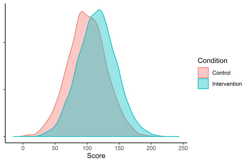
We can see that there is considerable overlap between the two distributions, and many scores of those who are in the control group are higher than those in the intervention group.
What this distribution looks like on a day-to-day basis for a practitioner
Each practitioner is not able to see 10,000 people… and plot all their data points… and then compare that to another 10,000 who did not receive any service. But we can simulate what it might look like if two people are randomly sampled from these populations and see who comes out with a higher score. We know that in general, the people who receive the intervention will be better off, but this is over a long period of time.
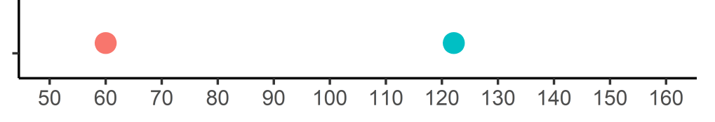
To demonstrate this, the sample size will be lowered to 1 for each group (instead of 10,000) and each person’s score will be plotted.
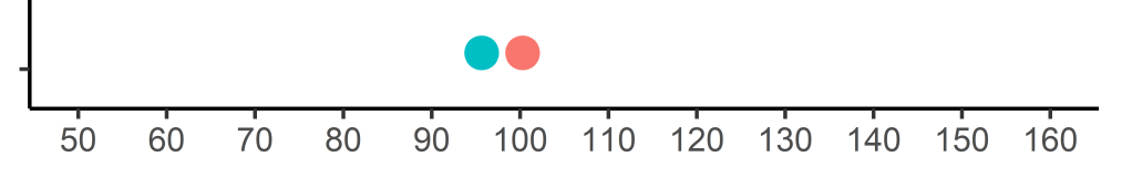
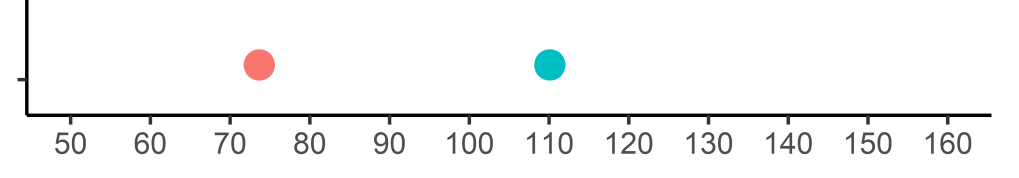
Let’s take a pair and plot it on a graph:

As before, the red dot represents a person from the control group, and the blue dot represents a student that received an intervention. We can see that the person who received no treatment was better off than the person who received an intervention. This, despite the person who received the intervention coming from a population that is ½ a standard deviation higher.
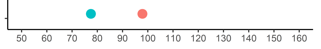
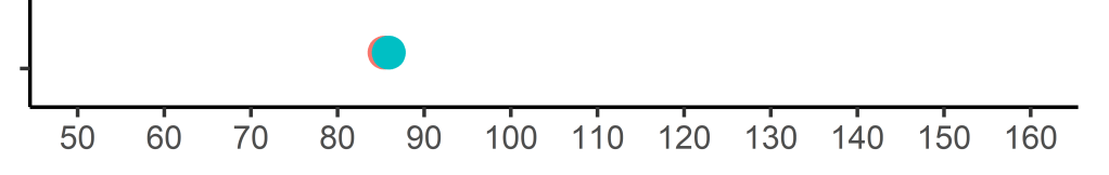
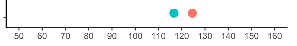
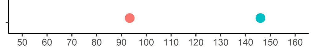
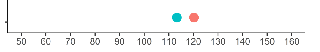
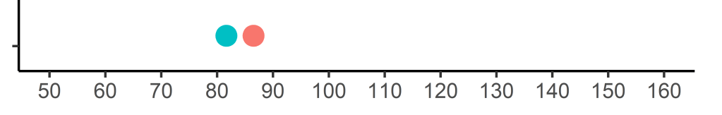
I’ll simulate a few more to show how these numbers jump around:
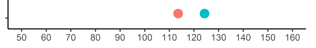
I hope it is clear now why saying something works or doesn’t work is fairly meaningless.
How often should we expect superiority?
The next step will be to see how many people in the intervention group make better progress than those in the control group. To do this, I have simulated the dot plot visualisations 20,000 times, and then recorded who obtained a higher score. Overall, when we choose two random people – one from the control group and one from the intervention group, the person in the intervention group will fare better 63% of the time.
Conclusions
In practice, it can sometimes feel as though little positive impact has been achieved after applying an intervention. What I aim to communicate is that we can provide a well-designed treatment that is followed with fidelity, and still come out with a result that would have been worse if no intervention would have been applied. However, providing treatments supported by evidence will mean that over the long run, many more people would have benefitted than if we did not intervene.